

Hook Your Readers with These Book Design Ideas
We do judge a book by its cover. Why not? It’s the first thing that catches the eye. It is the book’s chance to draw a buyer’s attention and whether or not it is worth buying. Therefore, a book cover should be impressive in its design and effective in giving the readers a hint of what to expect.
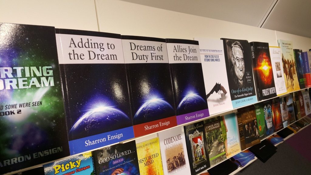
It is no secret that a book cover design is as important as the rest of the craft. It is a sales pitch while your book sits with thousands of others on the shelf. The book cover illustration is the factor whether your book is worth the money or not. Don’t know where to begin? Make your book irresistible with tried and tested tips.
Genre
Think about the genre when designing the cover of a book. The illustration should show which category the book belongs to in one glance. For example, if a book is exclusive to women, use light and feminine hues like pink. You can also use floral designs and gold foiling. However, if your target audience are men, avoid being too colorful and stick to darker shades. You can never go wrong with black as it gives a hint of masculinity. A good cover design should be able to communicate through the selection of colors, design, and typography.
Legible Heading
Typography is much more than positioning pretty fonts on a lovely background—it can make or break the whole design. Think about legibility. The title of the book should be clear and bold. Neither too tight, nor too loose, so it should be visible even from a distance. Moreover, avoid typographical errors. Sure, it would create an immediate impression, but a bad one. It gives off a sloppy vibe and readers would be enticed to look for more mistakes in the book. In designing book covers, one should also make sure that there is a decent contrast between the background color and the font color. This is to guarantee that your title is not dominated by the rest of the design.
Avoid Clichés
This rule applies to titles, illustrations, and even to font styles. Avoid overused and even “abused” typefaces like Papyrus and Comic Sans, unless of course if you are writing a humorous book. And with regards to the cliché illustrations, a lot of book covers in the market feature a woman in white dress, a woman by the lake, a man nearby a fence, or a warrior with a sword. These illustrations are overly used that they have become memes, so to say. If you are thinking of a punny and cliché title with bad wordplay, do yourself and your book a favor and stop that thought, now! Give your book a name that it deserves, and stop the urge to scribble something that has been used many times before.
Be Unique
Think outside the box and avoid using the common illustrations that most designers use and reuse. Do your research, draw a sketch, or work with new designers to find something unique and eye-catching. The most imaginative people go for original ideas. Try minimalist cover designs as they serve as a breather amongst the piles of colorful book covers sold everywhere.
Create and Compare Several Designs
Research, study, create, and modify. Creating the perfect concept for book designs is a trial and error process and long hours of work in between. You can visit Pinterest or Flickr for some artsy book cover ideas. Scroll among the hundreds of book cover designs and observe the concepts of the best-selling books to the ones who hardly made it. From that point onwards, you will know which designs work best. However, you will need to make more than one good illustration. You will probably need three or four that are most fitting for your book. Choose several people to criticize each design, and the cover with the most number of votes win.
This will inspire you to achieve your best book layout. Click here.
Welcome Criticisms
Same way in writing a manuscript, it is hard to see the mistakes in your own work. So you will need a few publishing professionals to evaluate your graphic design covers. Before handing your work to these experts, check for grammar and spelling errors,and look for typographical mistakes.
Lastly, calm your mind. Creativity’s vital partner is relaxation. So grab a bite, sip a cup of coffee, or take a walk. It is good to put hard work in everything you do, but take a break in between.
P.S. Have you ran out of creative ideas for your writing? Read this and craft your best writing ideas.
Leave a Reply

